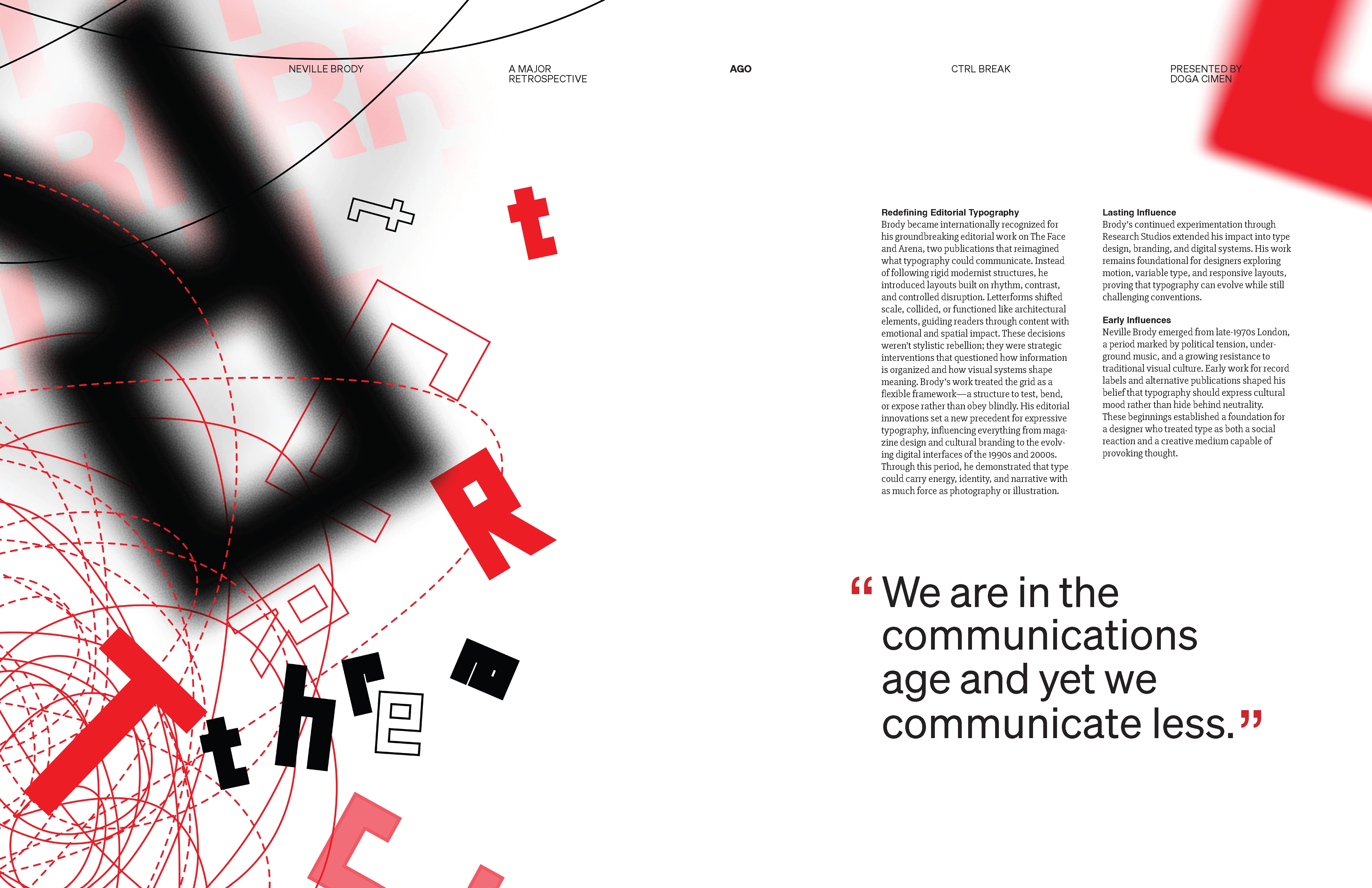
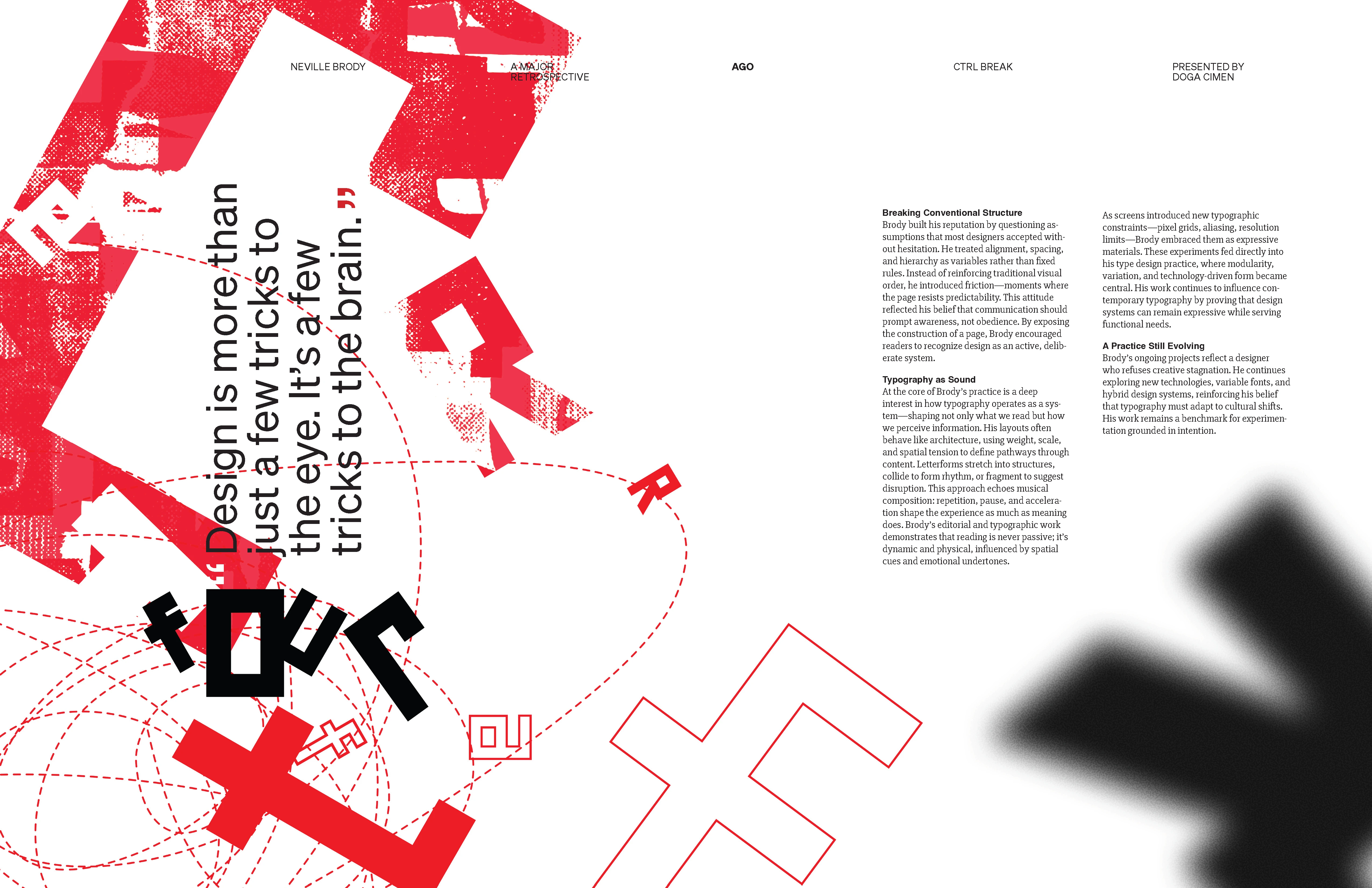
Design & Interaction
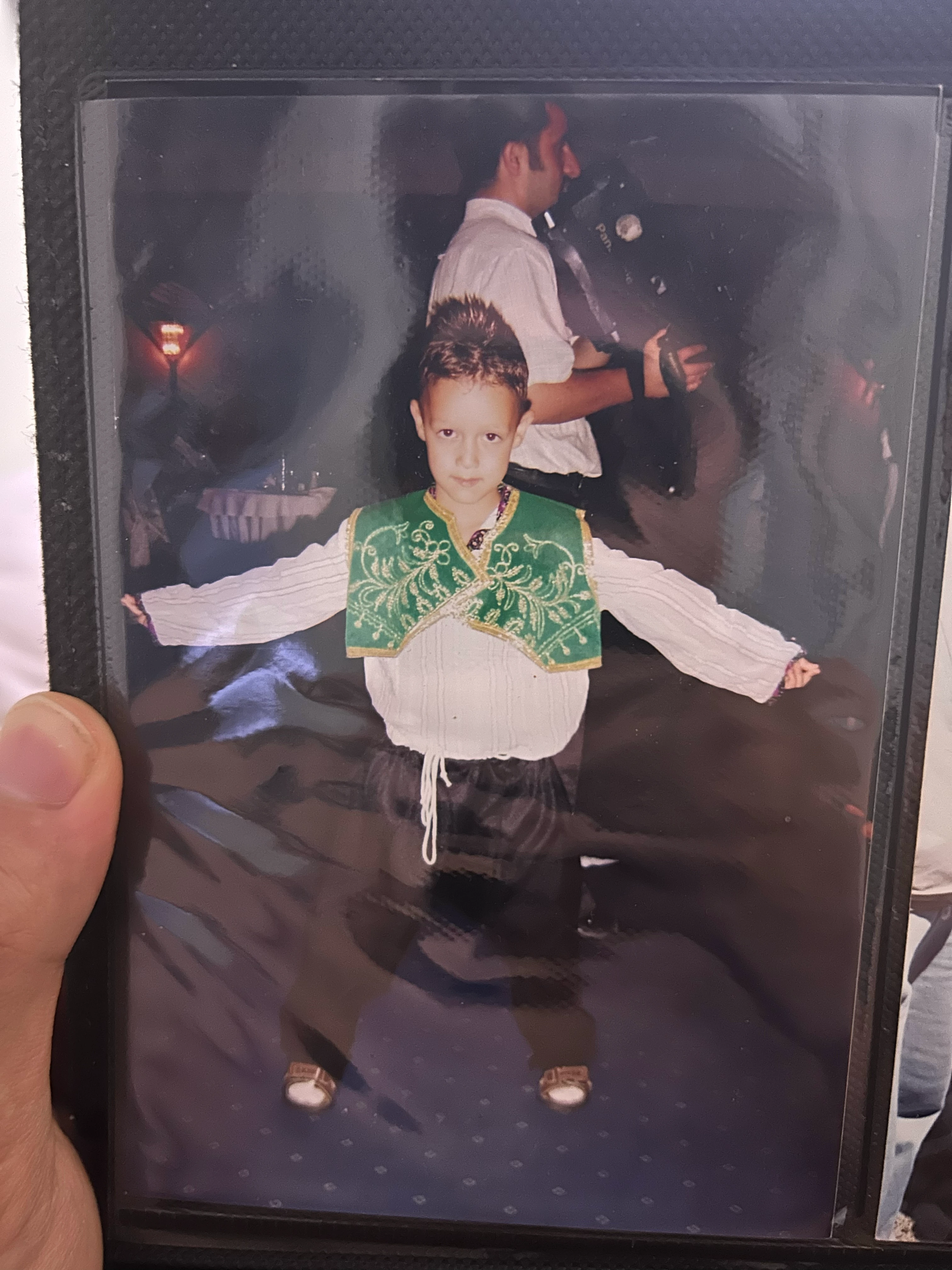
Hi, I'm Doga.
Antalya, Turkey
Toronto, CA
Graphic design student exploring the space between typography, brand identity and interaction design.
Tools
- Figma
- Adobe Ps, Pr, Ae, Ai, Id
- Cursor
- Claude
- Affinity
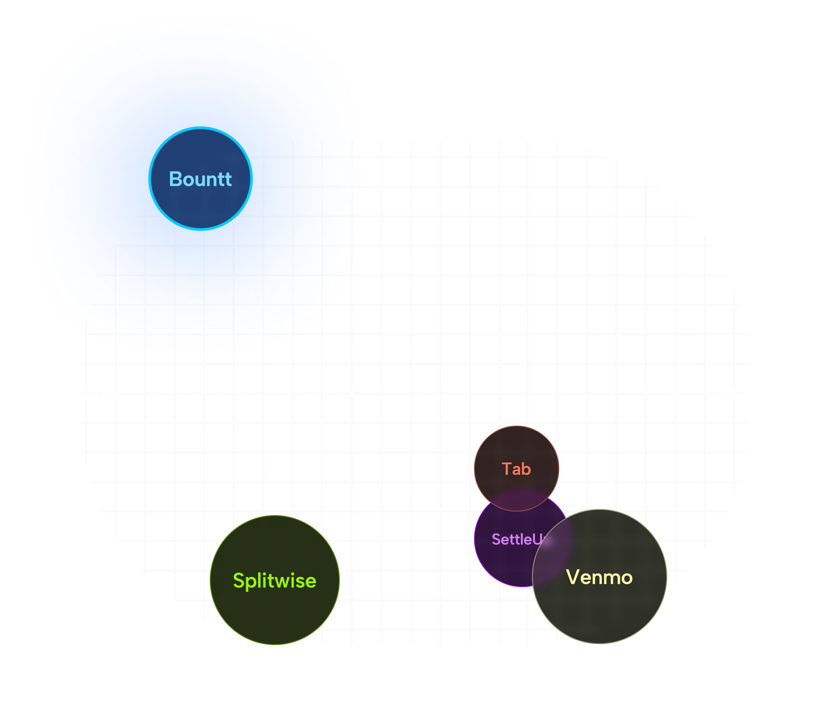
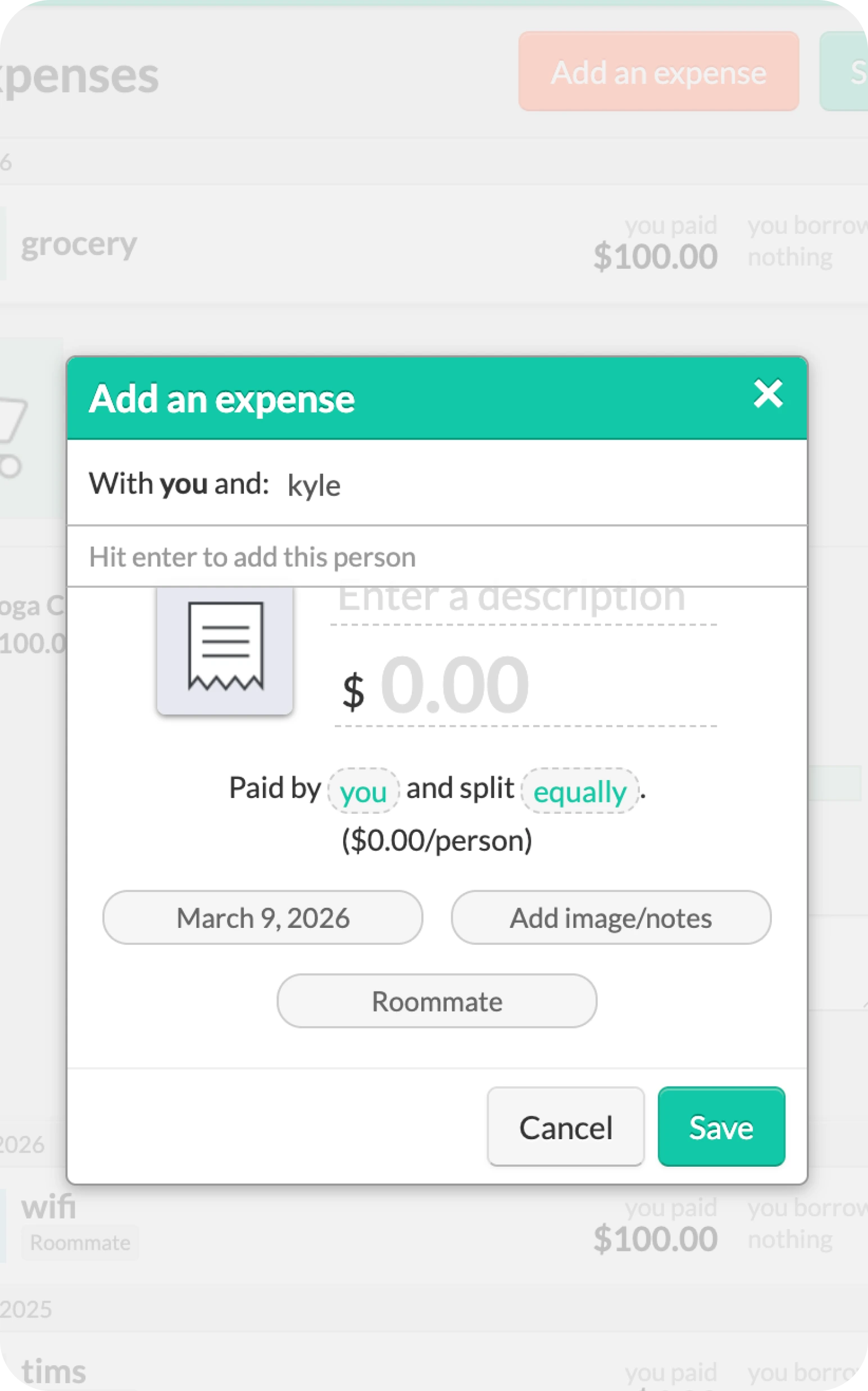
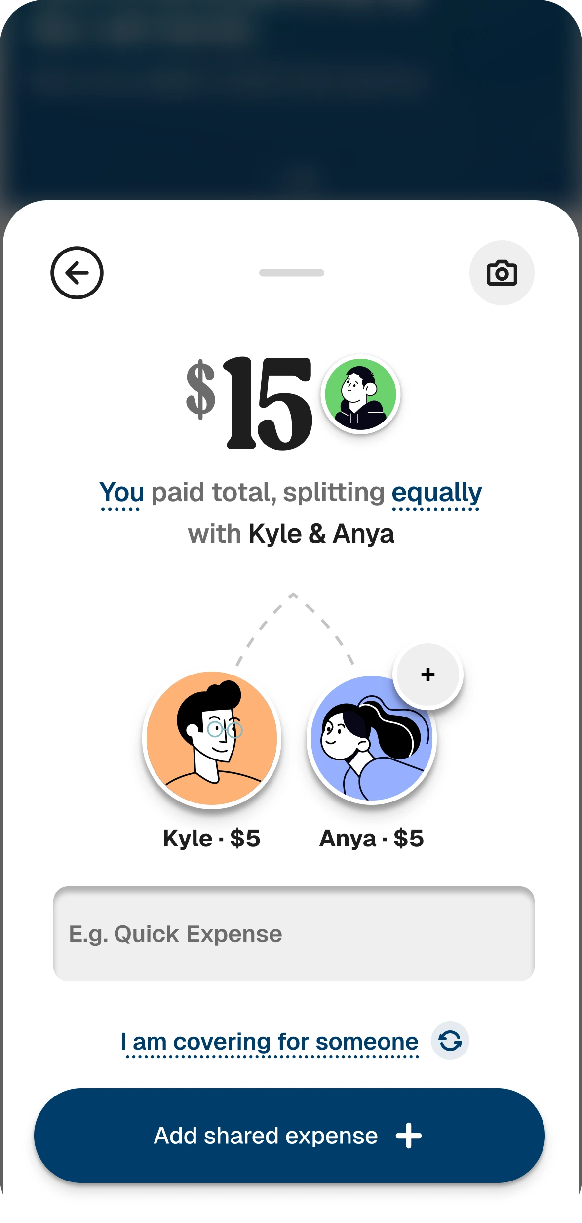
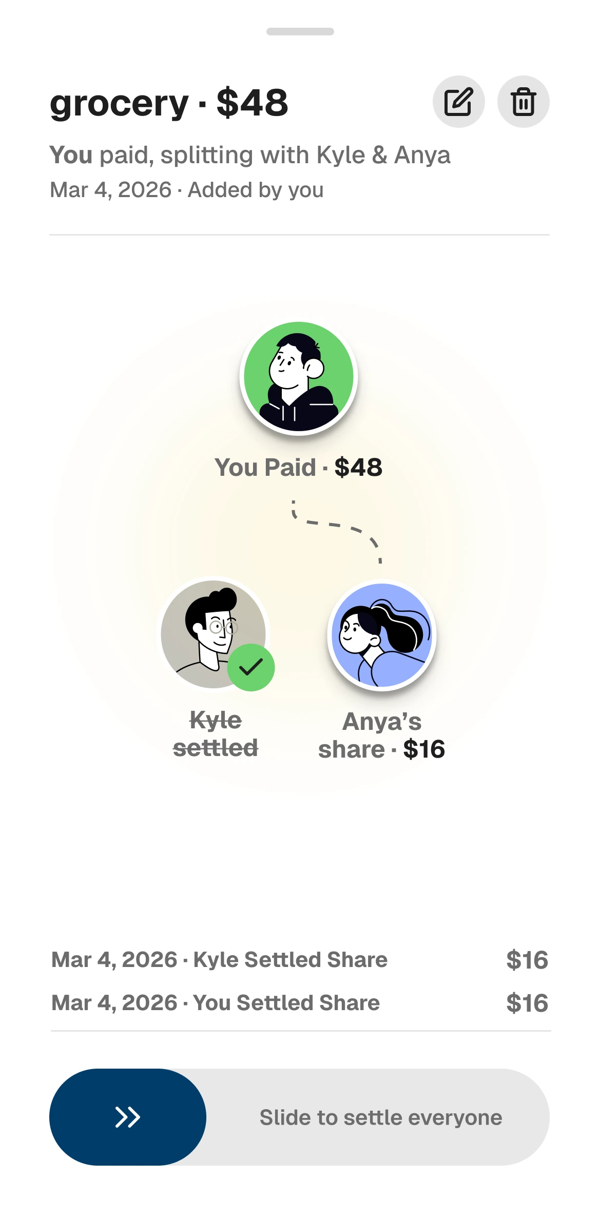
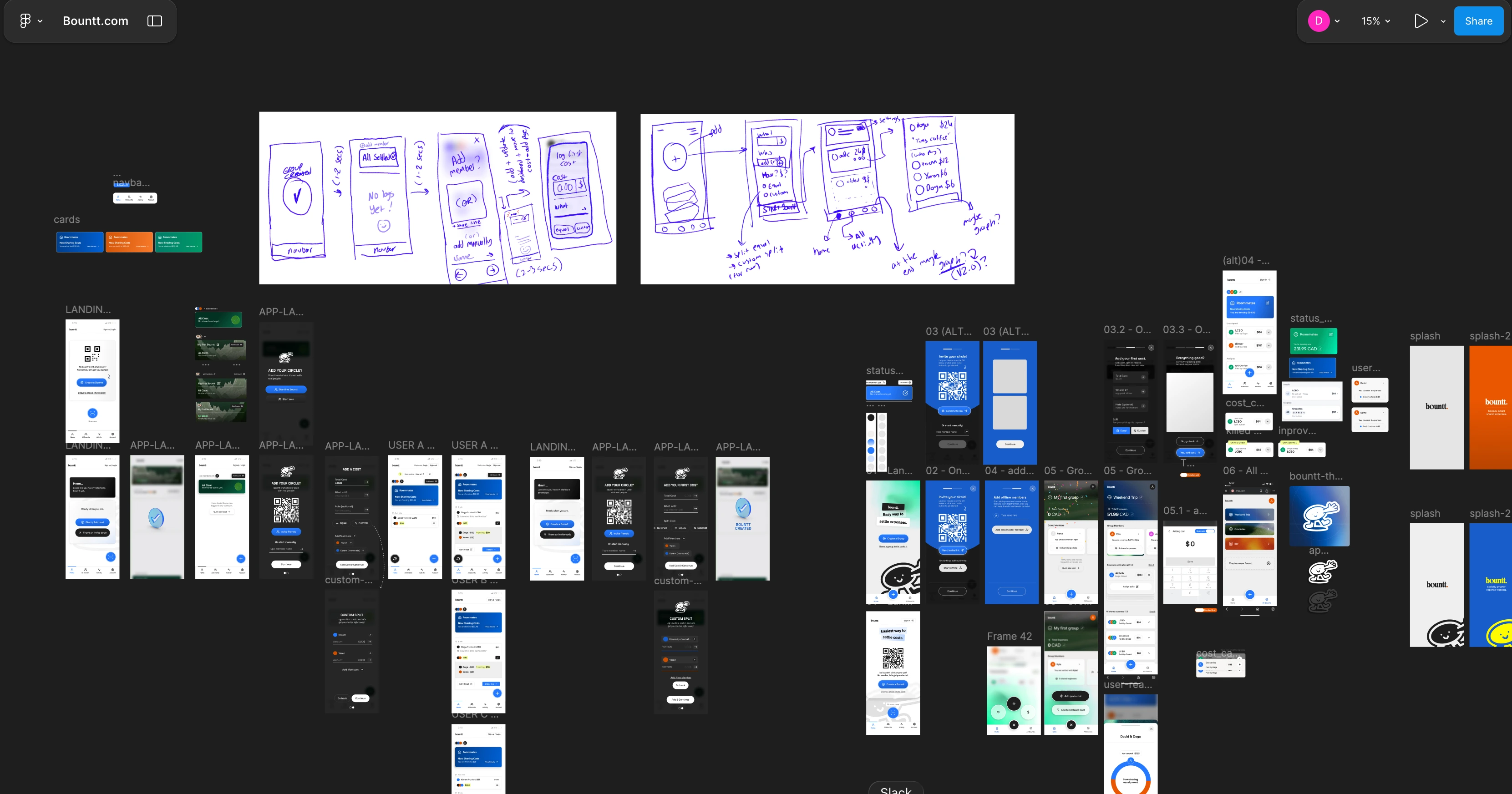
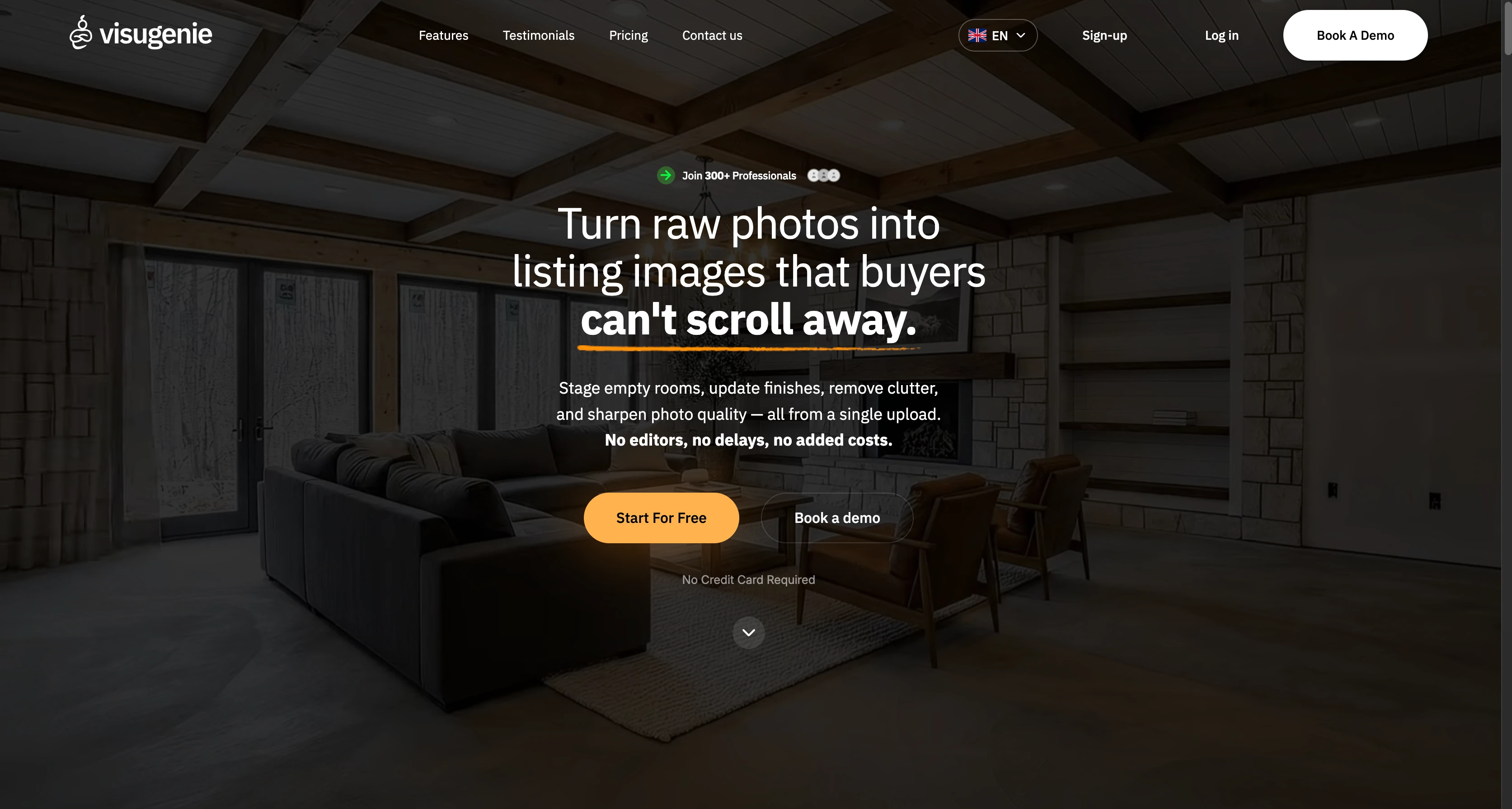
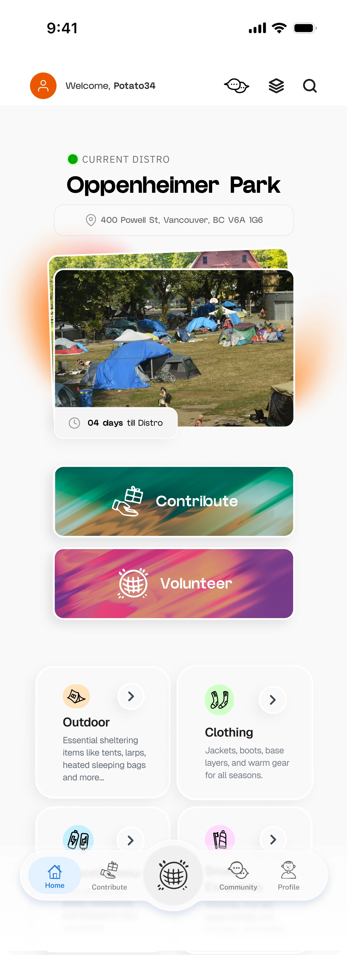
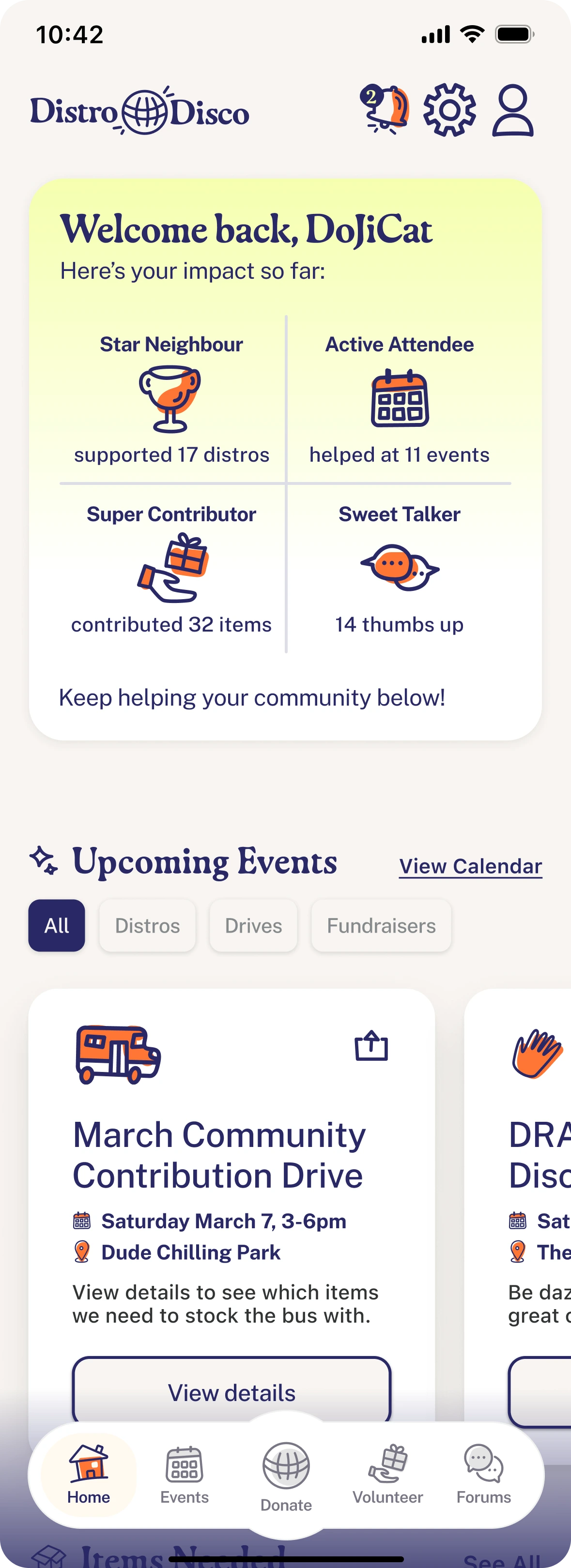
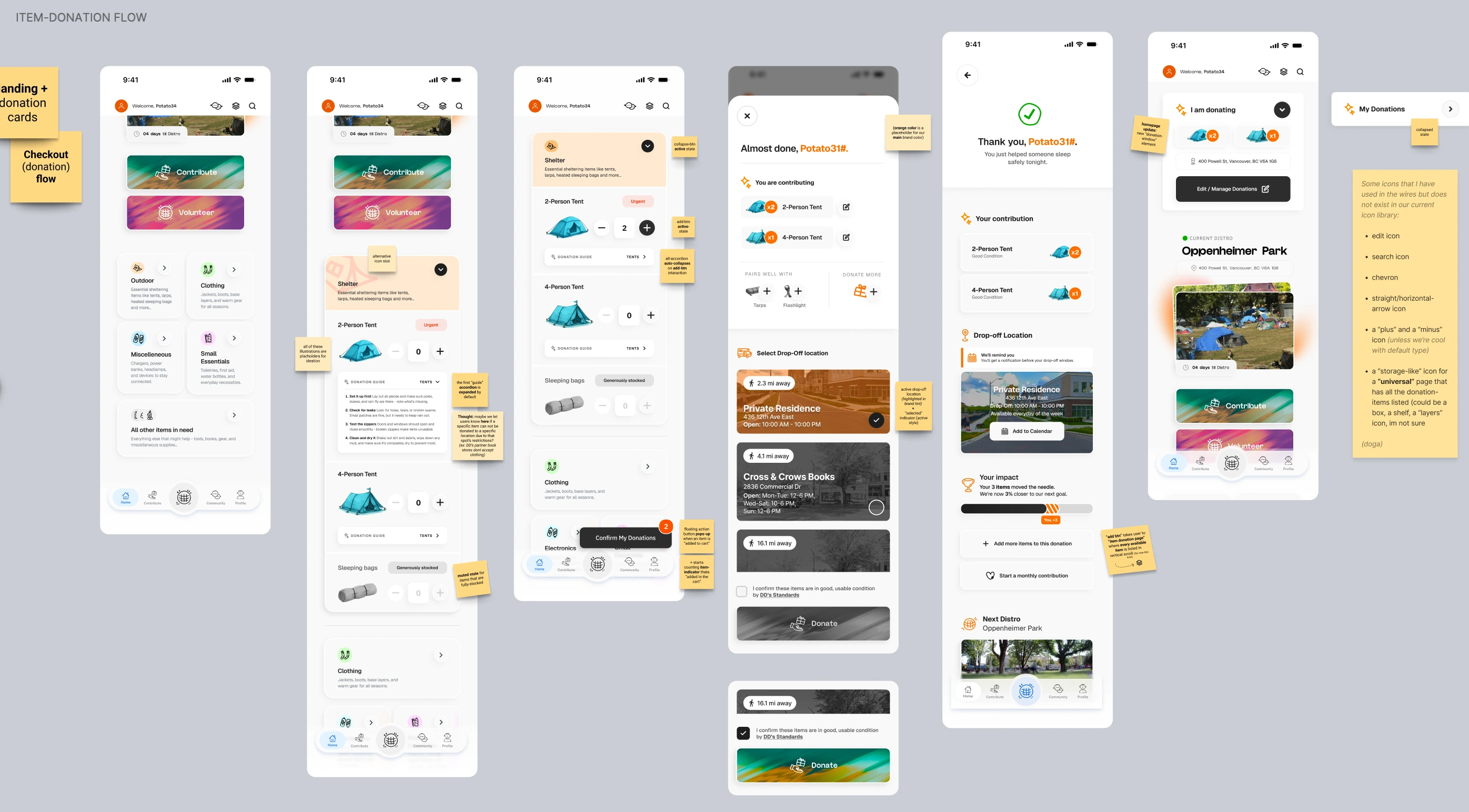
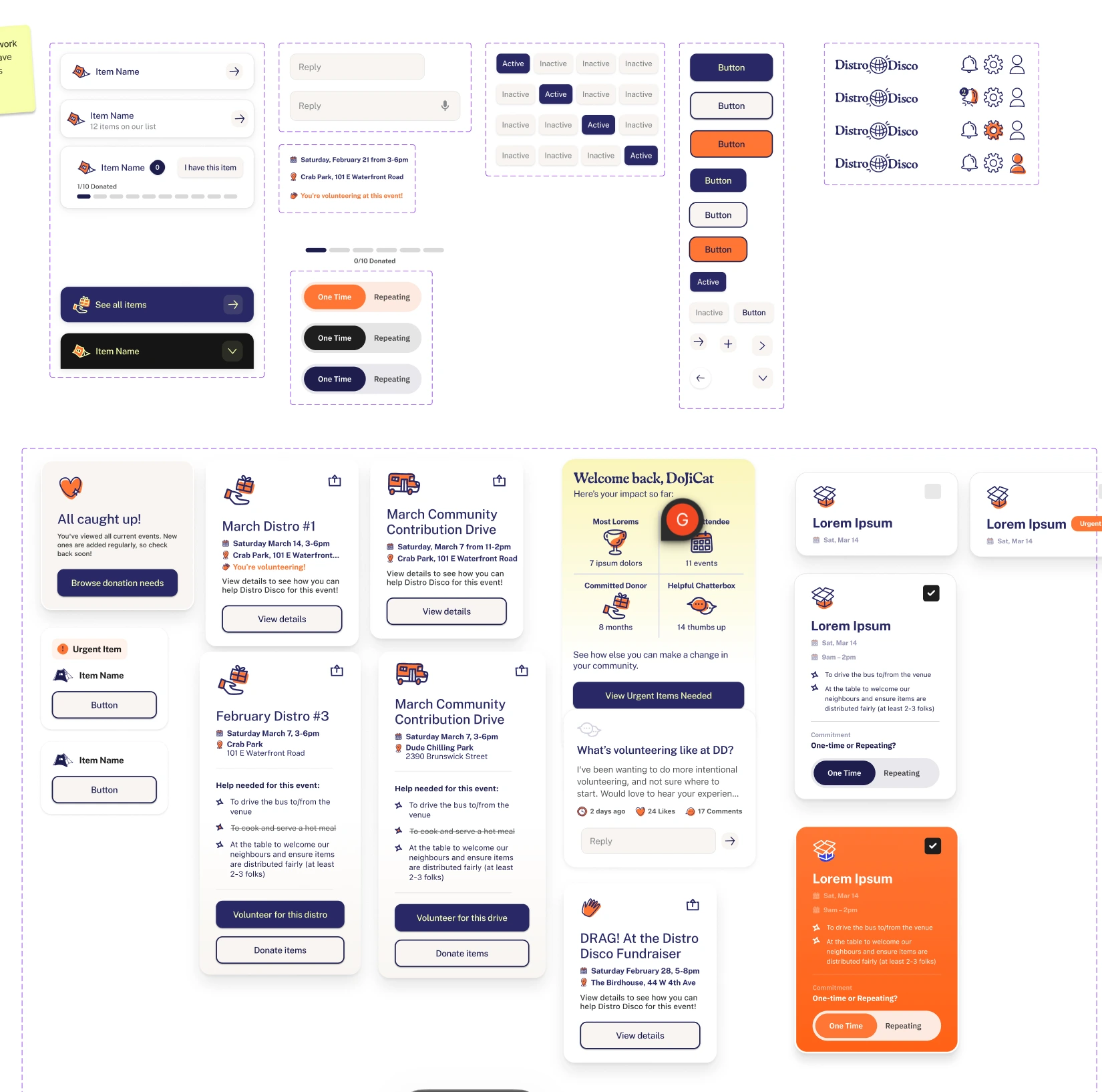
selected work
7 projects
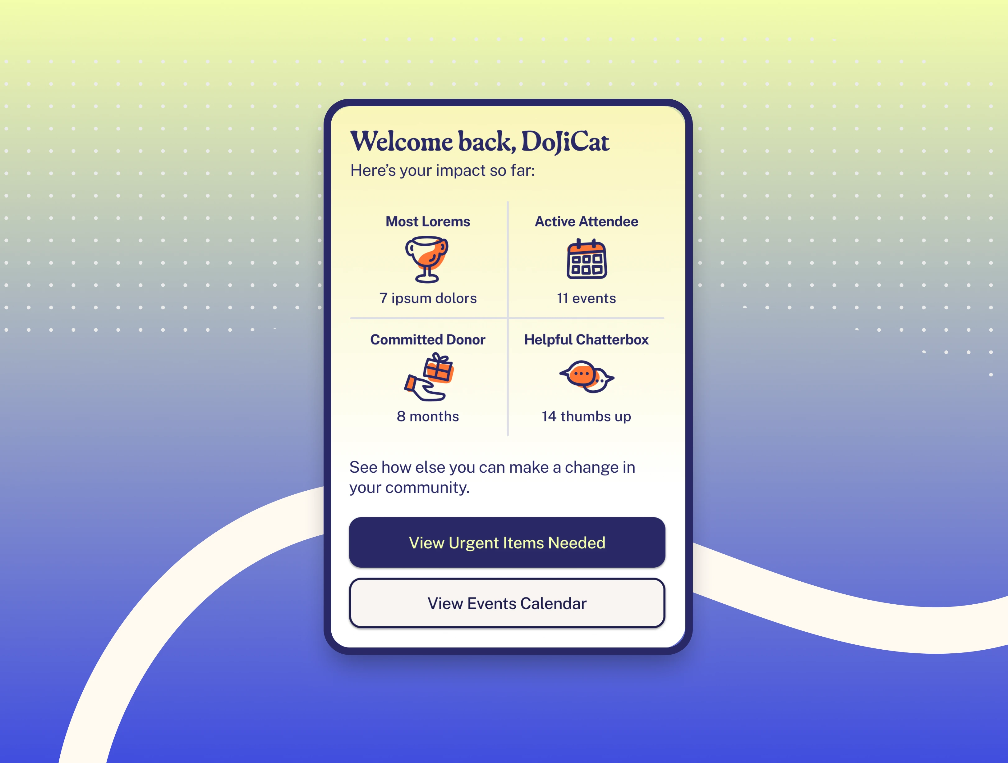
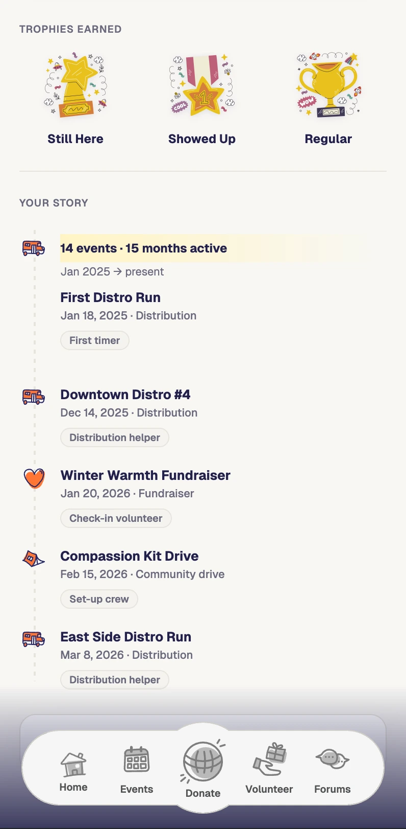
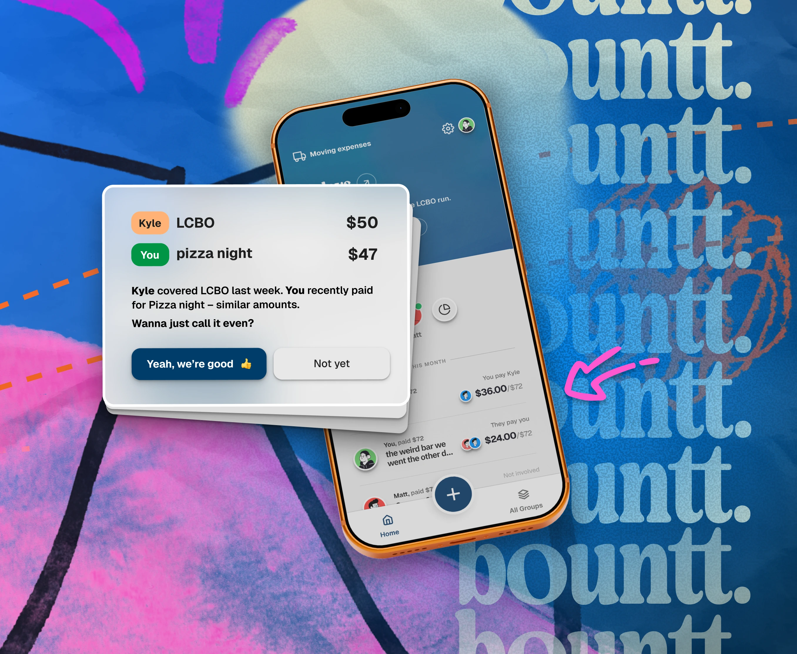 Beta
Beta


About
A bit about me
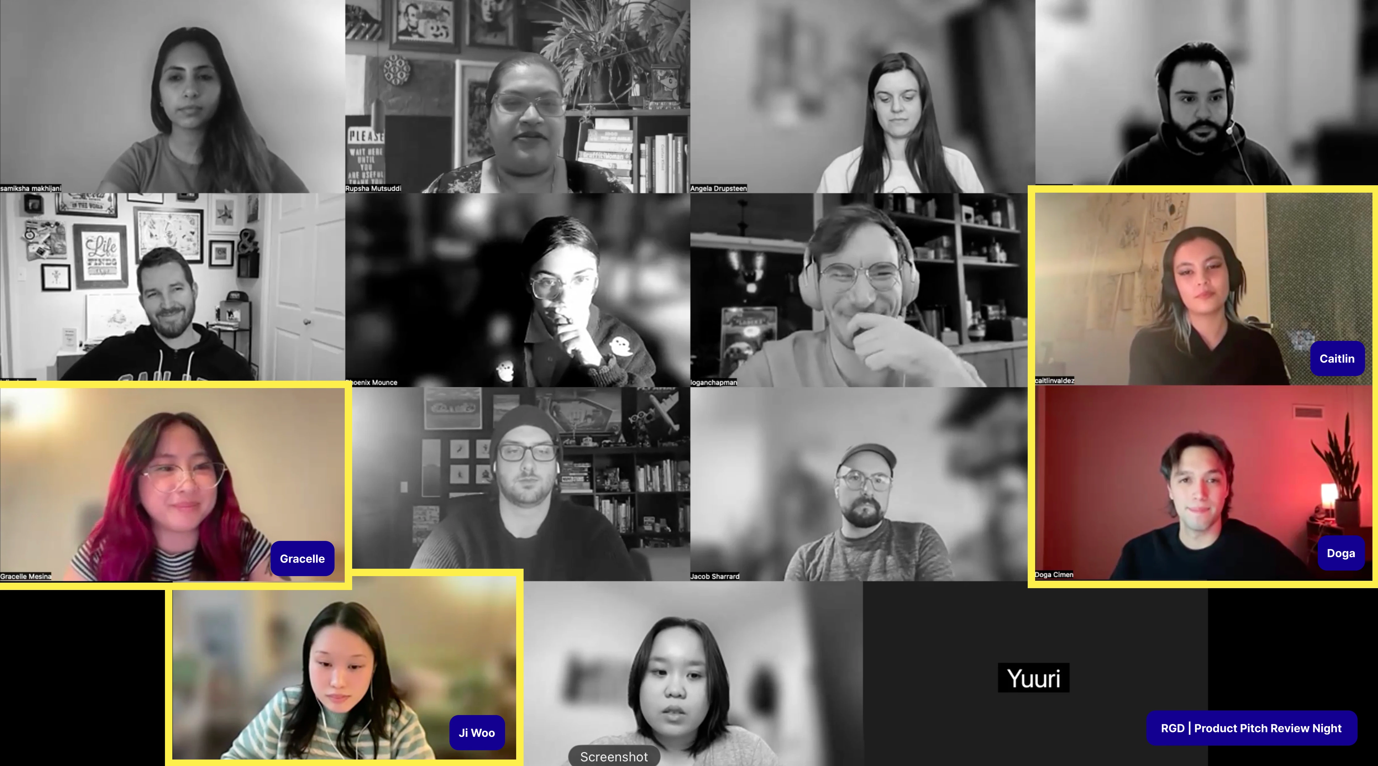
I’m a graphic design student at George Brown College in Toronto, originally from Turkey. I’m drawn to the intersection of design and psychology. When I’m not pushing pixels, I’m probably playing basketball,or experimenting with creative coding.
Open to Design internship opportunities for the Summer 2026


